

In praise of boring design
Nokia's PureI might be boring. That's why I love it!

Earlier this week, Nokia introduced its new Pure design system at Mobile World Congress 2023. The design system received a relatively low amount of publicity and got some traction on Twitter, mainly from the design community. Quickly, some argued Pure is too "boring" and "corporate". Some said it looks like a “random design system”, “lazy”, and way too “generic”. Pure certainly isn't the most shockingly different, provocative or innovative.

I'm afraid I have to disagree with the random, lazy and generic ones. Although corporate and boring, I can see why some said that.
In my opinion. it’s a good thing. Why? Read on :)
Nokia Pure UI - some context
First and foremost, let’s root ourselves in Pure’s purpose. It’s a design system for B2B and enterprise products. It will not appear on consumer devices, at least not anytime soon. I think that’s quite a shame, but we’ll get to that later. Regardless, we should adjust our expectations of what is or isn’t boring based on this target segment/purpose.

Nokia Pure isn’t hot-off-the-press new. It already won Red Dot Design Award in 2021 and pocketed the iF Design award for User Interface / Interfaces for digital media. I really can’t think of more prestigious design accolades. Why is it then that Pure is getting announced only now?
Let's dive in
This is how Nokia describes Pure
Nokia Pure is the latest design system update that has been evolved to produce consistent, flexible and future-proof digital products. The system is made up of foundational elements, components, templates and guidelines, all of which facilitate in producing a fresh, clean and minimal new brand expression for Nokia B2B and Enterprise digital products in line with the new brand expression.
Colours
The crisp colour palette refers to Nokia's past (blue! ). But it doesn't stop there: you'll find brilliant purples, cyans, pinks and everything in between. The overall feel is 'edible'. I love that!
Typography
Typography looks very clean. It's hard for me to comment on multilingual typography as I'm far from an expert. It's good to see it mentioned, though. The typeface, Nokia Pure, is not new. The typeface was designed by London’s Dalton Maag and won the Graphics category award in the Design Museum's Designs of the Year in 2012.
I mentioned Nokia Sans, the predecessor of Nokia Pure, designed by Erik Spiekermann, in my previous Weeknotes.

Funnily enough, Erik thinks the Nokia Pure typeface is boring, too.

Icons and illustrations
I sense an element of playfulness and tongue-in-cheek expressed by the curved lines in icons that feel almost hand drawn.
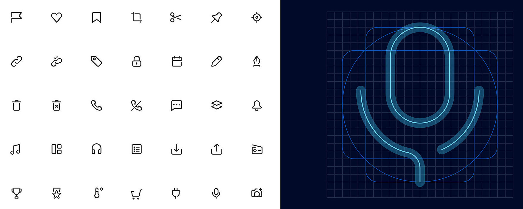
Illustrations are elegant, slightly more stylised and 'softer' compared to the (literally) heavy-handed illustrative style that dominated the web/app world a few years back. Moreover, the illustrations seem incredibly modular, which provides flexibility designers love. In Nokia's own words, "using interchangeable elements and abstracting gender and skin tone helps to keep the illustrations inclusive".

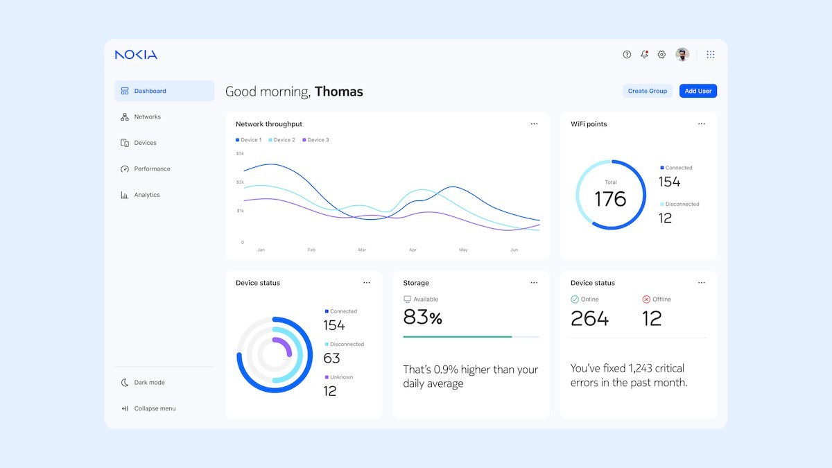
Dashboards

The dashboards look yummy but perhaps way too uniform. They feel like a mashup of data where every element has the same level of importance. That, of course, is often the challenge of super-clean dashboards in general.
Briefly on Nokia’s past product design
Some called Pure "boring" or way too "corporate". And perhaps they might have a point. Pure lacks the diversity of Nokia's hardware design from the late 90s and 00s. We are not in the same territory. Nokia used to be way bolder with their physical product design than they are today with their software.

I couldn’t help myself but go on a little memory lane trip. When it comes to *consumer* devices, Nokia used to experiment much more. But we need to view this from the perspective of the era and target customer. All phone brands had similar feature sets, constraints, and similar-ish firmware. At the time, the physical form was the main differentiator. Plus, as mobile phones became ubiquitous, they inevitably connected to fashion differentiation. That would differ in the B2B/enterprise range, where Pure UI targets.
Nevertheless, Nokia’s old phone lineup is pure (pun intended!) and slightly insane eye candy.
In praise of boring design
Let’s set the B2B/enterprise factor aside for the moment. After all, shouldn’t B2B users be provided with the best design possible?
Why should we praise Pure UI for being boring, then?
Every day, we interact with tens of apps, websites and services. We receive notifications aimed to draw us in and boost engagement metrics. The rapid fire of short-form content is showered upon us 24/7.
I don't think a phone OS should attempt to grab our attention or surprise us in any way. I want the OS to blend into the background. I like the OS to be 'quiet', not overpowering. The smartphone OS is a blank canvas that the user should paint on. And design system is a canvas for designers and developers to unify experience.
Emptiness
In his book White, Kenya Hara poetically describes a concept in Japanese culture that he calls emptiness. He argues empty allows for the user’s imagination to fill the space or the user’s own way of utilisation to fill the space.

If you're more of a video person, Kenya Hara talks about this beautifully in this Interaction 18 keynote.
There’s a fairly relevant approach called Hodo-hodo, that Taku Satoh discusses in his Just enough design. It’s interesting how these philosophies contrast with the opinionated approach in western design.

This is incredibly interesting, especially in the context of how the needs of advanced users differ from the needs of perpetual intermediates. I will definitely unpack this topic in the future.
Calmness
There’s another angle we can take, and Mark Weiser’s Calm technology inspires it. I do not intend to venture into the ubicomp discussion here.
To paraphrase Mark, technology can live on the periphery of our attention. This way, it is not overpowering but intelligently comes forward to the centre of our attention when needed.
I recommend examining Mark’s Designing Calm Technology (and while you’re at it, you should also read his seminal Computer for the 21st Century).
A design system is the equivalent of Lego bricks for the OS. It’s not in the middle of attention but provides a path to what matters. It’s a blank canvas. It should be as empty and as calm as possible. If some want to call it boring, then so be it.
Pure is not extraordinarily original. It doesn't scream "SURPRISE!" in your face. I count that as a really good thing!
A design system for a phone OS *should* be boring.
The best way to describe Pure UI is an 'immaculate candy shop'. Pure but not sterile.
I’d love to get my hands on a device with Pure UI.
Other stuff
Farewell, DPReview
Amazon is closing DPReview. I really can’t believe this. Amazon is closing this gem of a community and wiping off all reviews, discussions and galleries. As a result, hundreds of thousands of hours of fantastic work will be gone. Puff.

I’ve been coming to DPReview for advice, reviews, or just to read the forums since 2006. We’ll part with a significant part of internet history, people’s history. It’s such a shame Amazon couldn’t find another way (because there’s always a better way).
Goodbye, DPReview.
I’m excited about
Arc browser! The Browser Company struck the right chord here. Arc is my new favourite piece of technology!


This week I’m reading
Neil Gaiman’s Snow, Glass, Apples is a thing of beauty. It’s solidly in Gaiman territory, as you’d expect from the master.

The illustrations by Colleen Doran are fantastic. Don’t buy this for your kids. Not every fairytale is what it seems :)
And that’s a wrap!
Thank you for your time and reading 🙏. See you in a few weeks’ time!
Jiri